Project
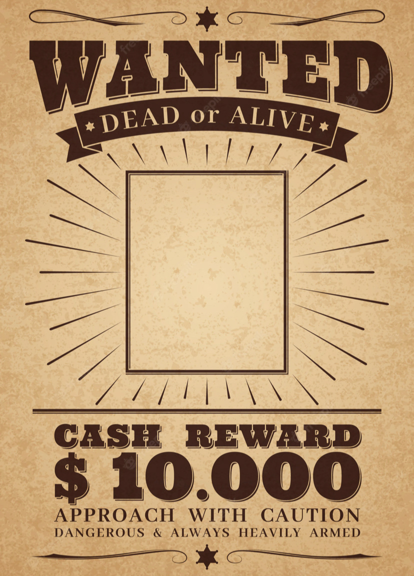
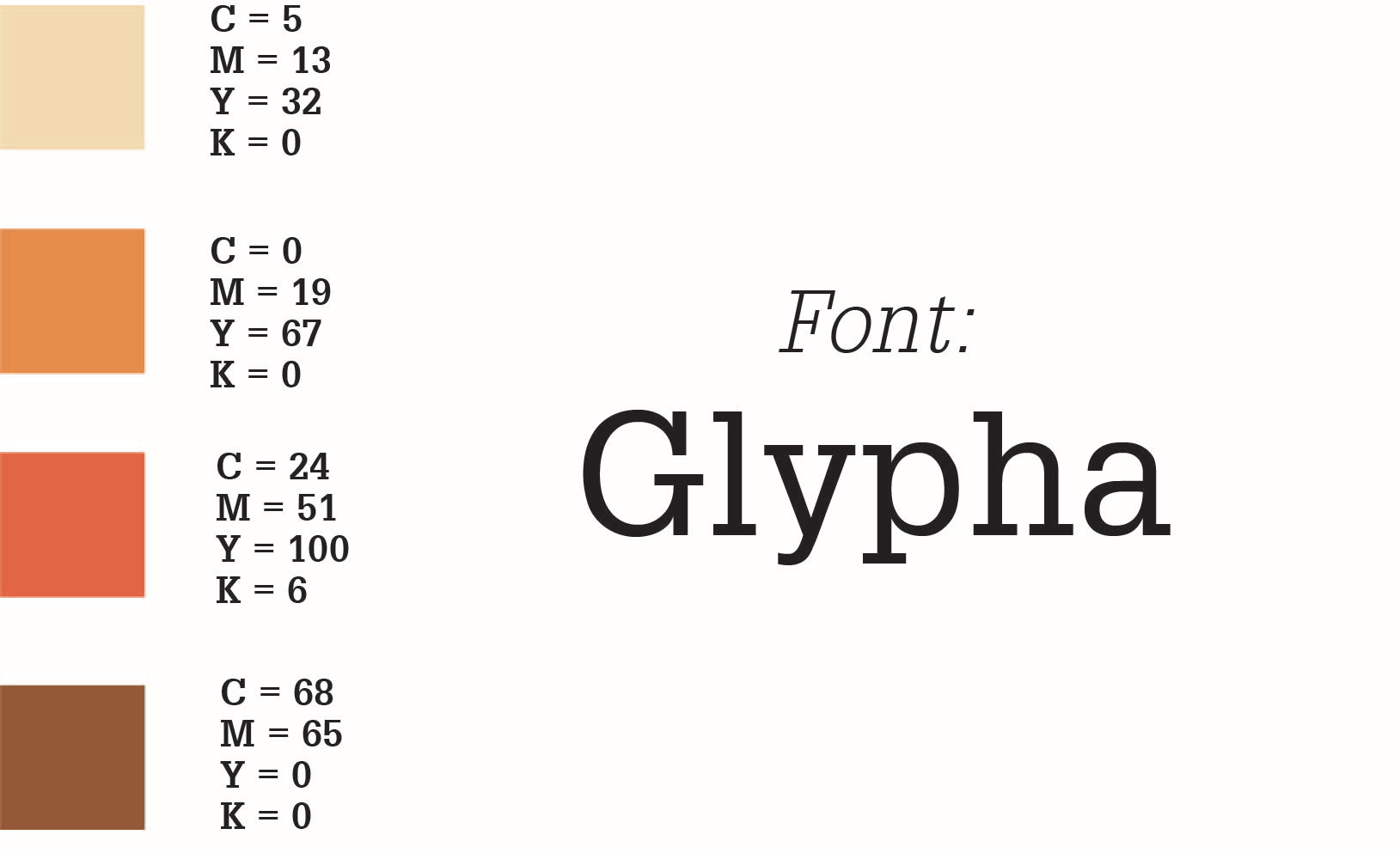
In this assignment, students were tasked with creating a triptych style poster featuring a specific font from an influential typographer. I chose the font Glypha for its unique slab serif style and for Adrian Frutiger's significant contribution to typography. I reference both the history of slab serifs (wanted posters and other old-fashioned printing) and the retro aesthetic that would have been present at the time of Glypha's creation when choosing color palette and design choices.
Research
I was heavily inspired by 70's style art, graphic design, and aesthetics. I also wanted to use the classic wanted poster format to highlight Frutiger in a lighthearted way that referenced the origin of slab serif fonts in its popular usage. Overall, the colors and styles blended well.


Process
The design process involved sketching different ideas for a portion of the poster before translating it into a draft in Adobe Illustrator. For this example, I used different related words and symbols to try different potential designs. I settled on the Cs, Os and Es to illustrate the oval based geometry of the font.
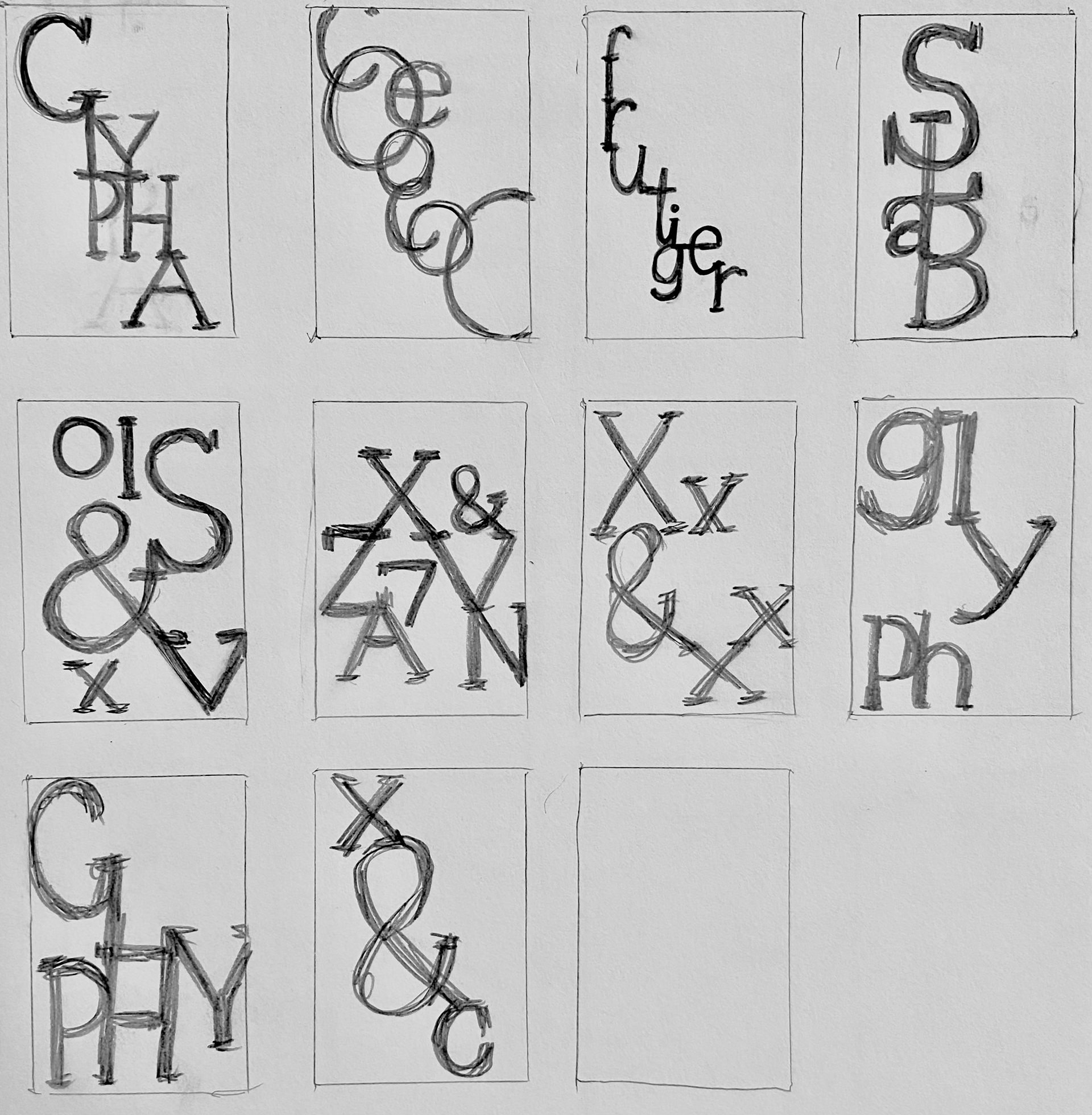
design process for type as image
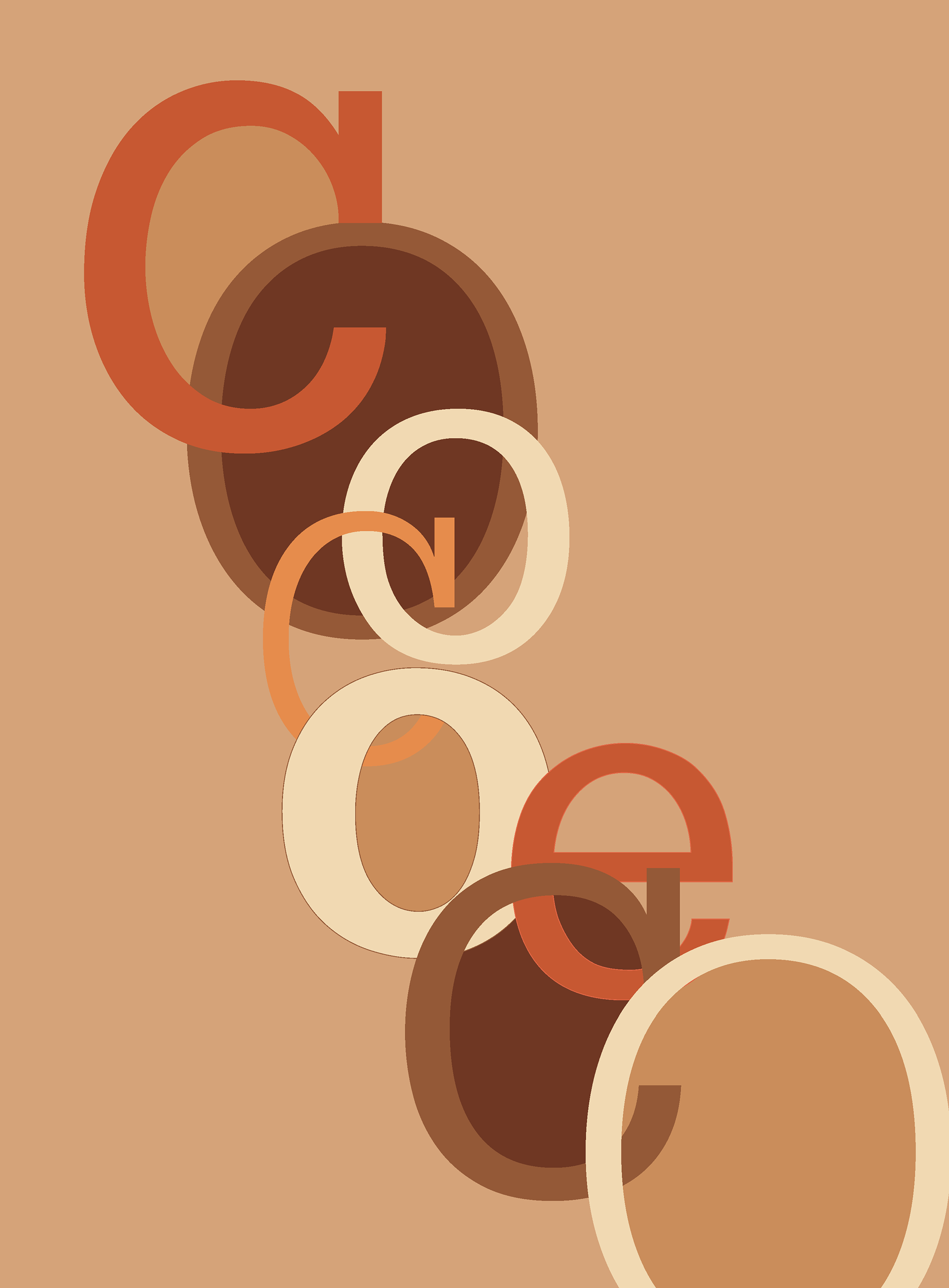
type as image used for poster


For the poster, we were required to include an image of the typographer. Frutiger had very few images online, so in order to make a clearer image that also suited the poster, I drew him in Procreate using the classic 70's portrait style.

a low resolution image of Adrian Frutiger at work

vintage portrait designs

reference for line art style


Result
I placed the layout into a three poster triptych mockup, staying with the neutral colors and weathered, retro aesthetic. Overall, the three posters are unique, yet cohesive and display the information clearly.
