Project
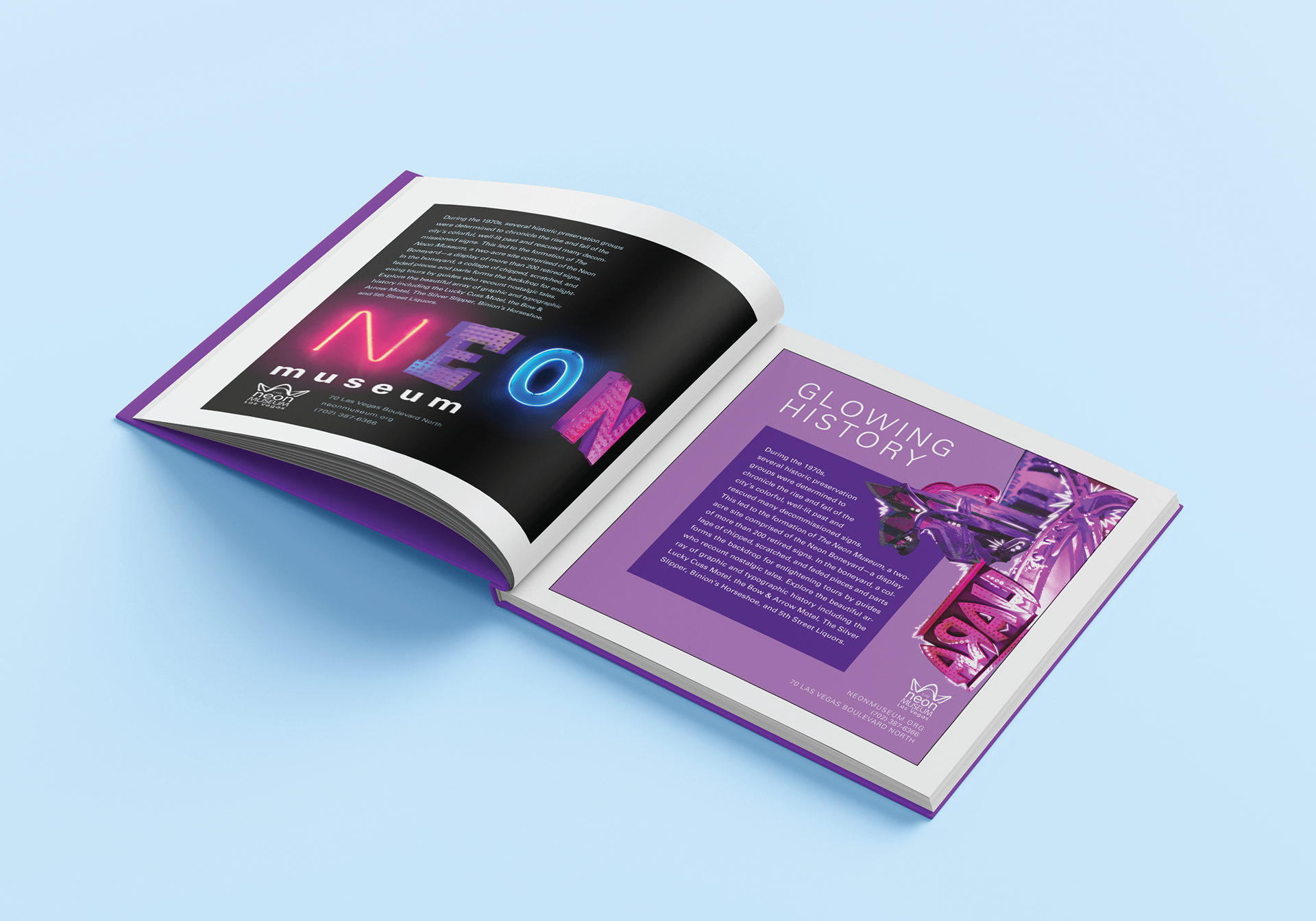
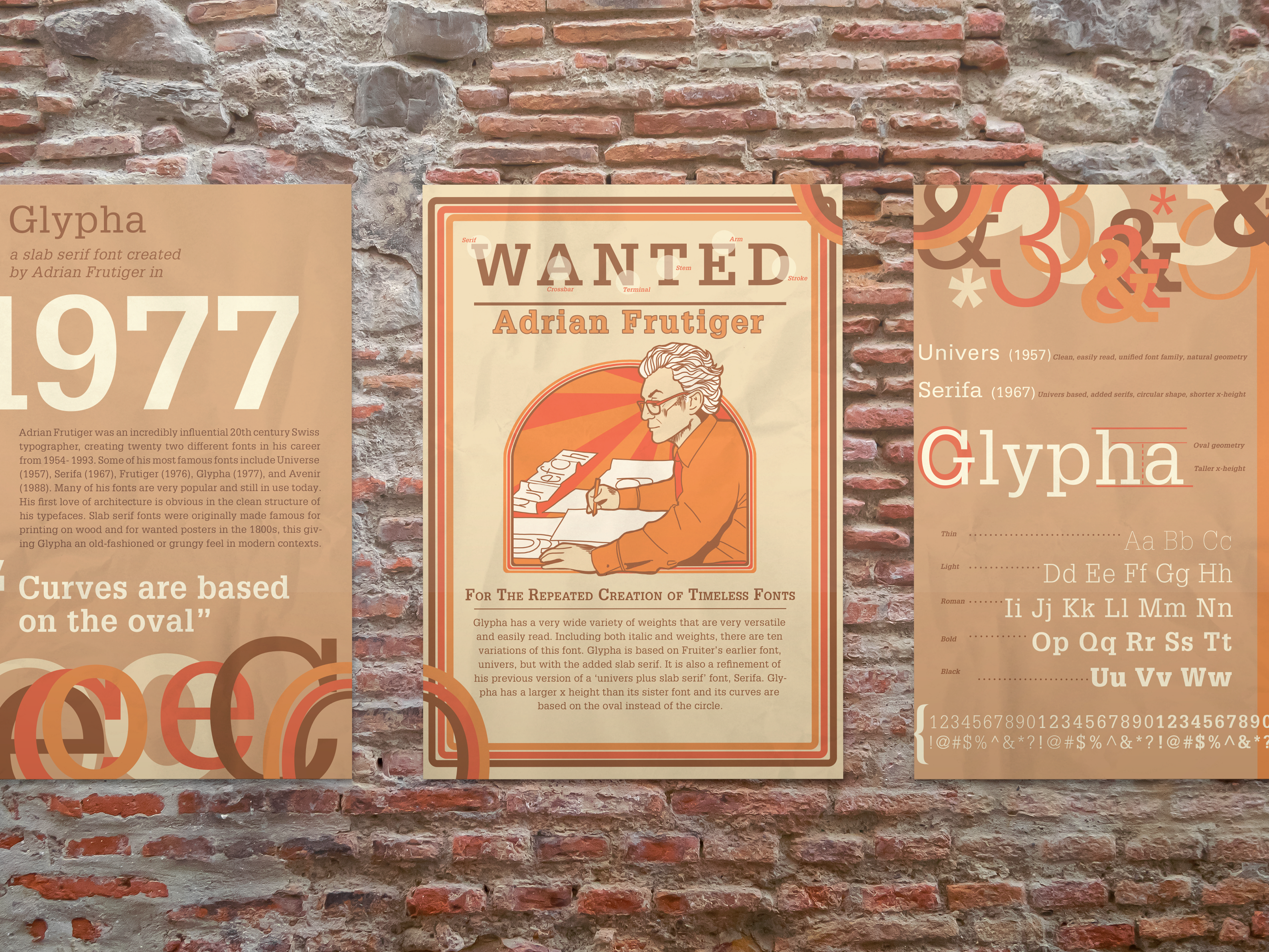
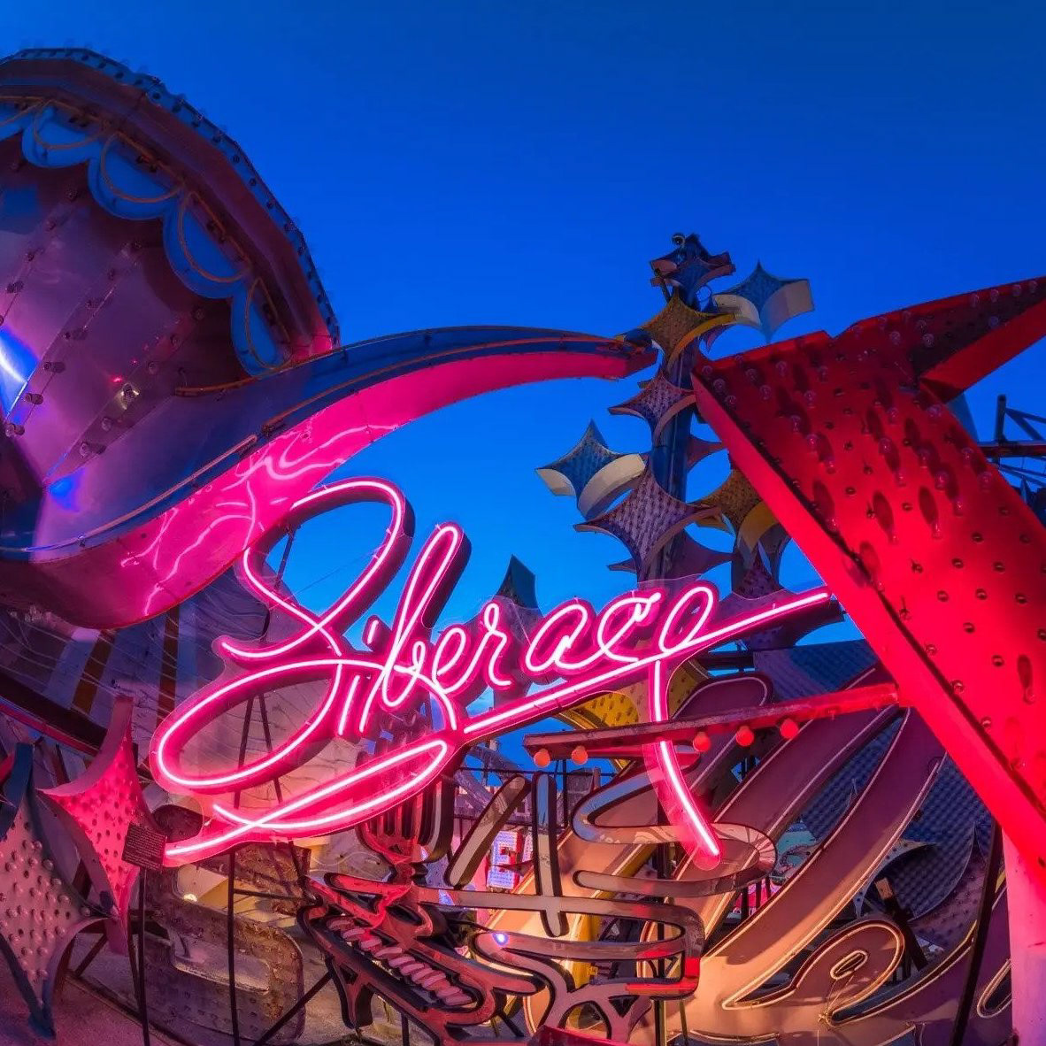
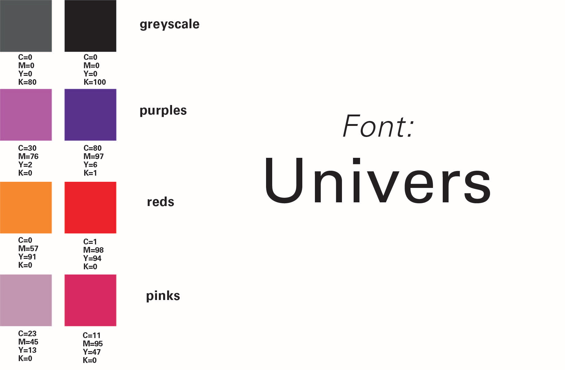
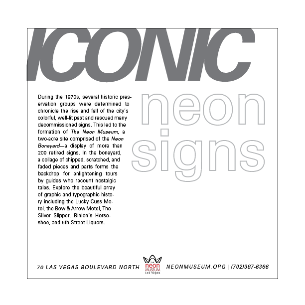
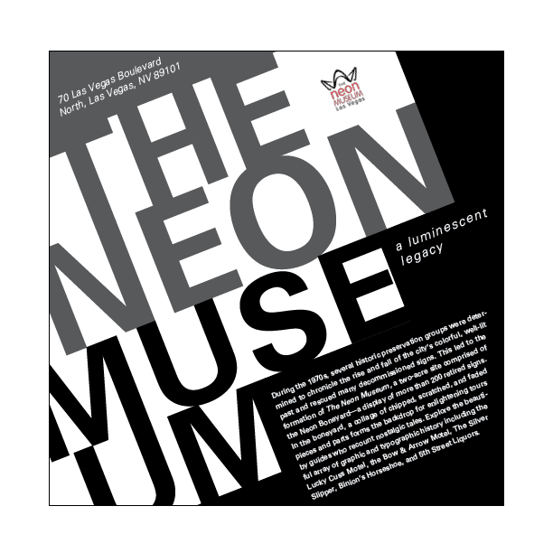
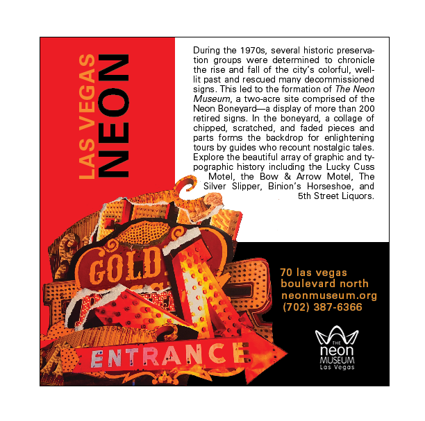
Using research of an art museum, students explored design concepts in typography. Using layout, font size, orientation, graphic additions, and color, I created different layouts advertising The Neon Museum in Las Vegas. I used the bright colors from the signs for inspiration.
Research
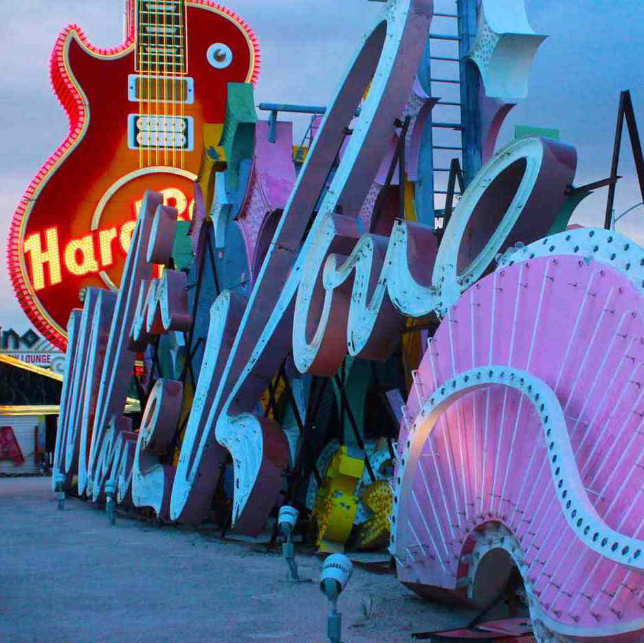
I researched different styles of typography using hierarchy, scale, axis, weight, and shades. I learned how to line up bodies of text to create clean and compelling typography posters. Additionally, I looked at images of the Neon Museum for creating graphics in the final study.

Process
I created sketches in order to practice layouts for the final pages and recreated them in Adobe Indesign. These design were reviewed many times and edited until all paragraphs and words aligned elegantly. I repeated this process for axis, graphic element, and image (seen below). The images were created by physically collaging photographs of the neon museum signs.


Result
I placed the best of my final typography layouts and image collages into mockups for a theoretical informational book on the Neon museum in Las Vegas.
